


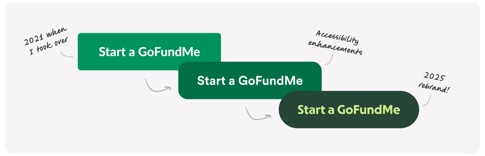
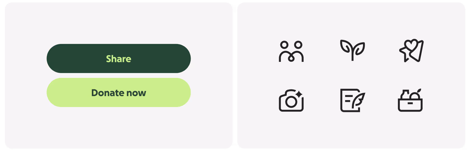
I didn’t join GoFundMe to build another rigid, soul-crushing design system. I wanted to see what happens when a visual design perspective leads the way. The language was dated, accessibility gaps were real, and tokens didn’t exist. So, with just an engineering lead and me, we rebuilt components to be modern, usable, and scalable.
Along the way, I learned that balance matters—staying agile and evolving the language without stifling innovation. This approach turned a scrappy helper into a design system that—now with a team of eight—drives over $40 million a year for the business.
Several years later, I’ve grown from a staff IC into a hybrid senior manager + IC role, still leading the design system with my original engineering partner. Along the way, I’ve led, directed, and supported critical projects that shaped our impact, including:
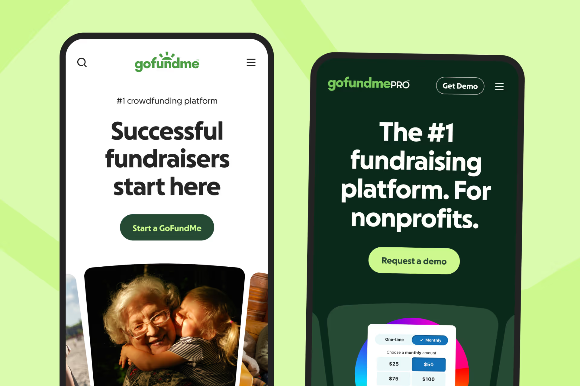
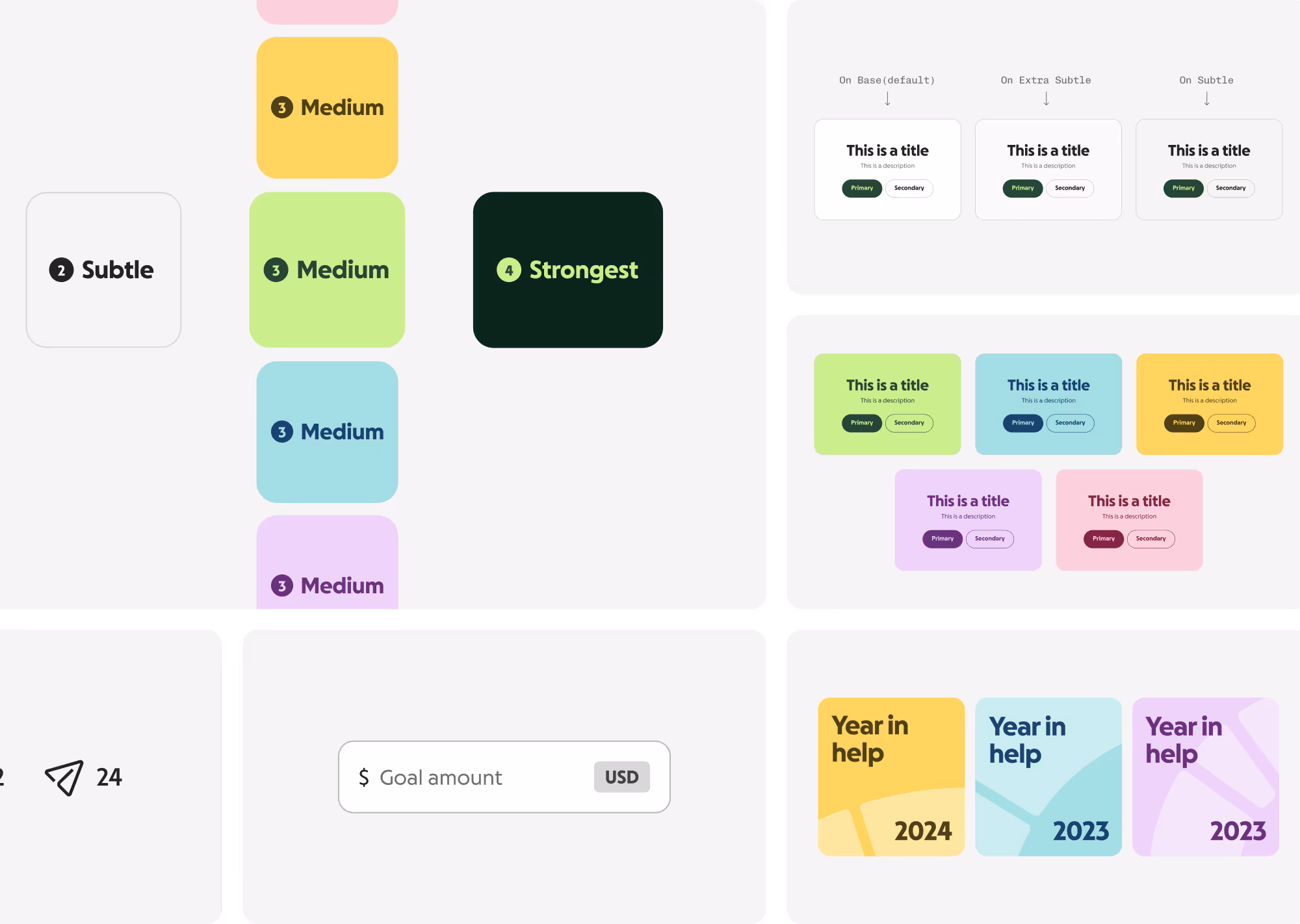
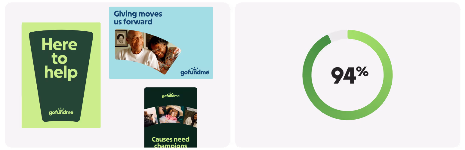
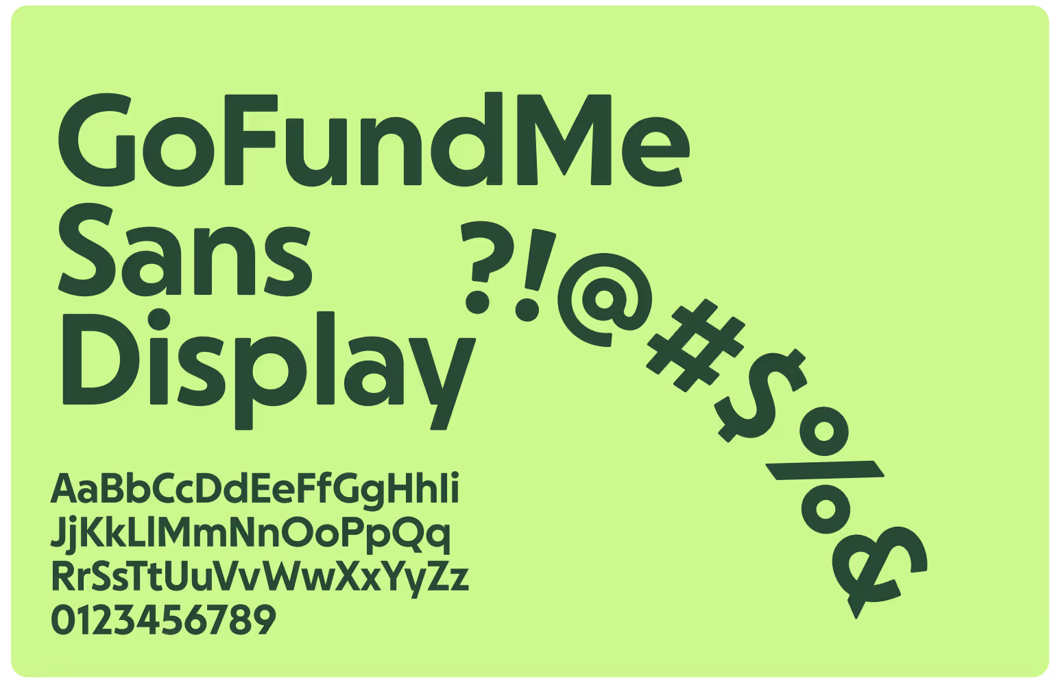
Partnering with our brand team and Koto, my role was to help shape a new identity that fit into our design system without compromising on accessibility. I led the color exploration, refined our custom typeface, and guided the team in creating a cohesive language.
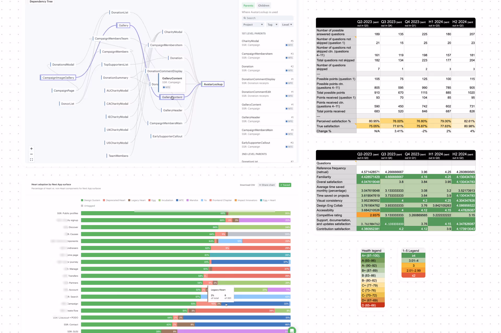
We set out to measure the impact of GoFundMe’s Design System and found $1.5M in annual time saved—but we wanted to know what that really meant. With our Senior Director of Business Operations, we dug deeper, and what we uncovered was far bigger than anyone expected.
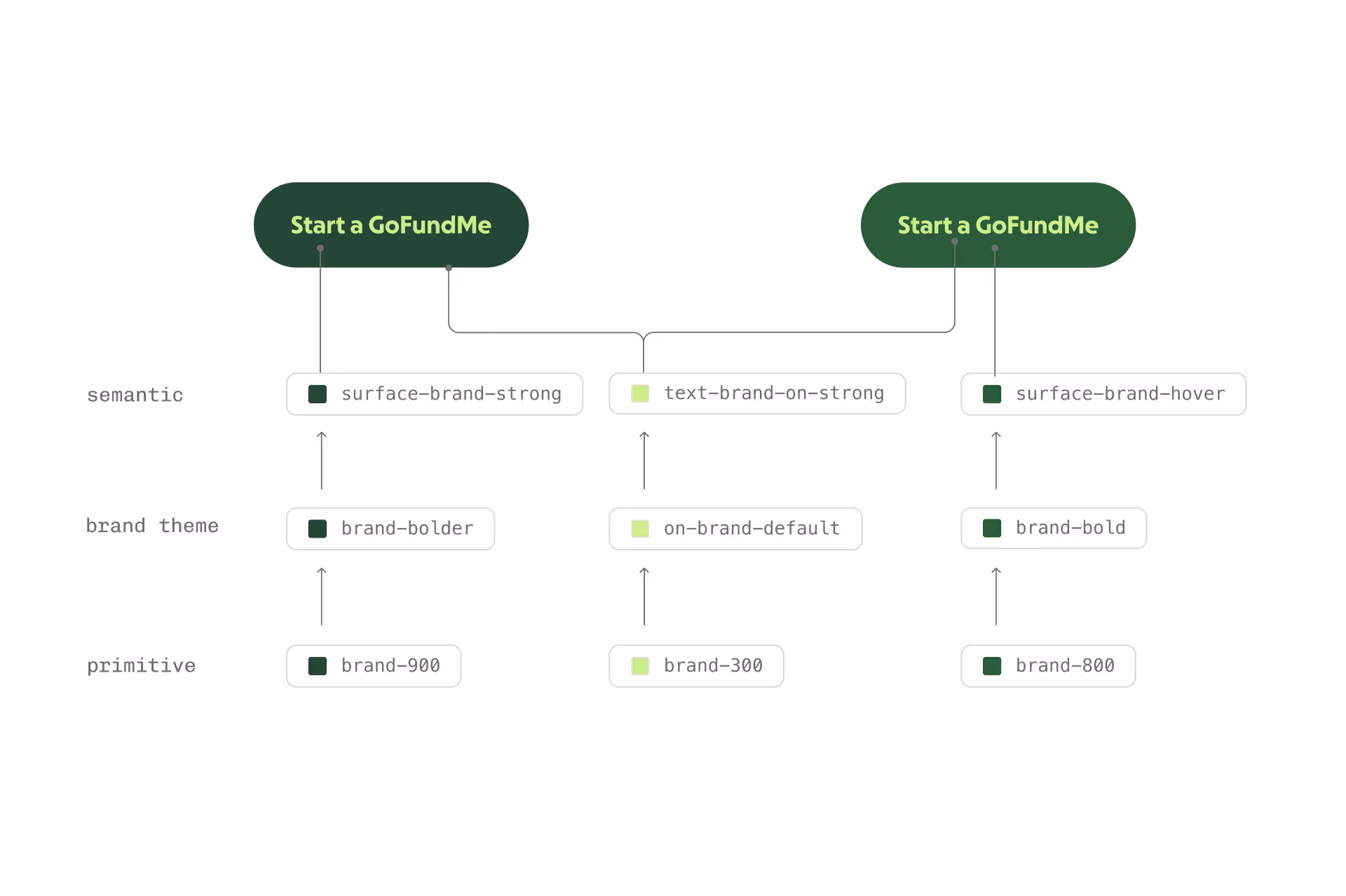
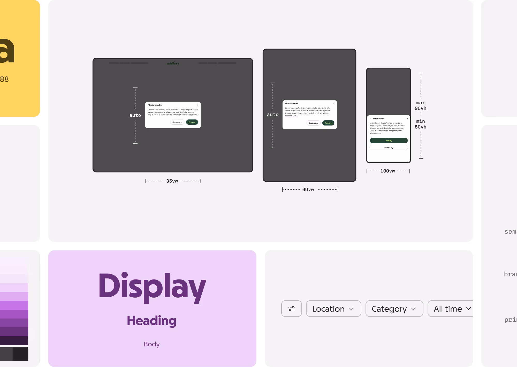
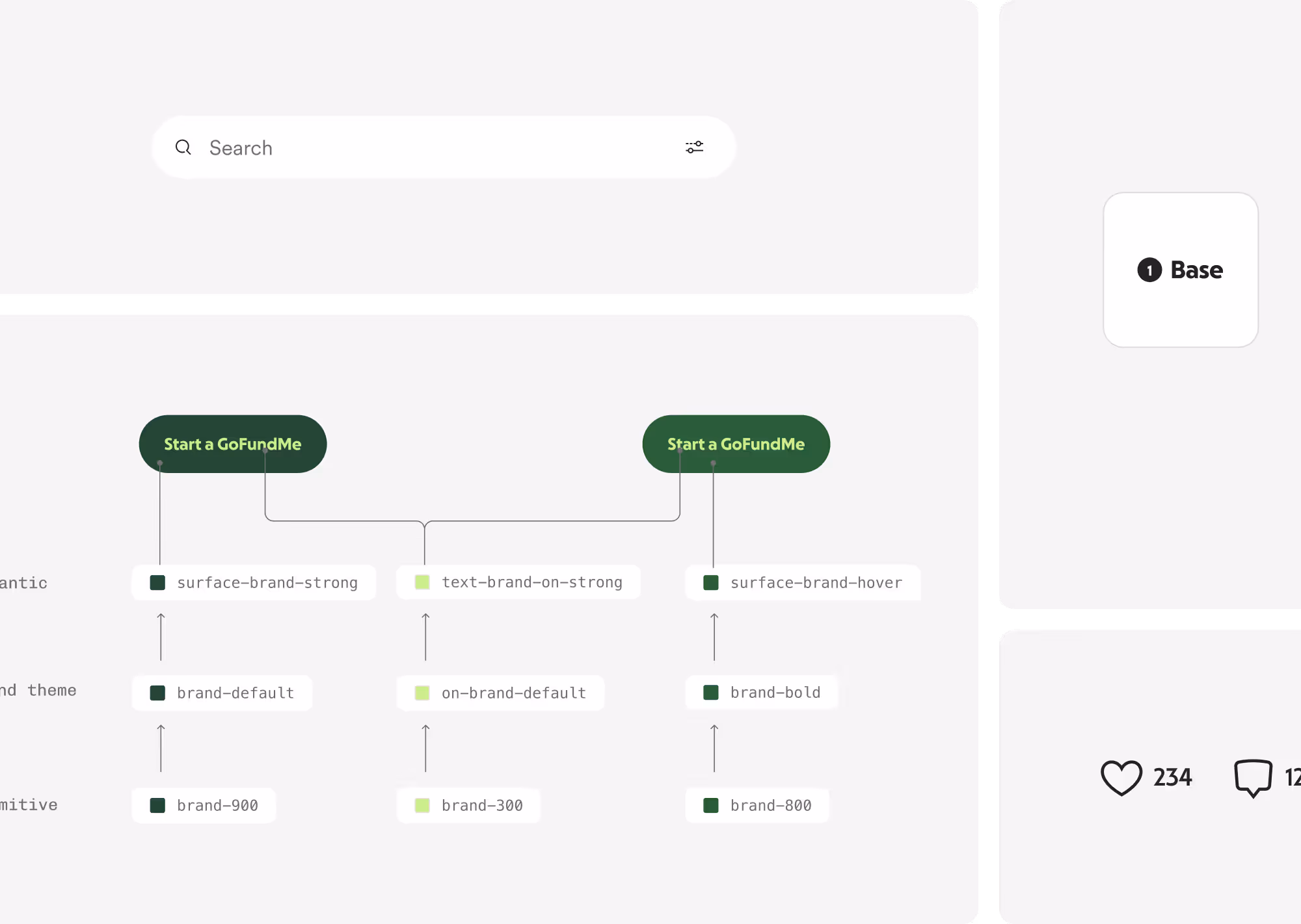
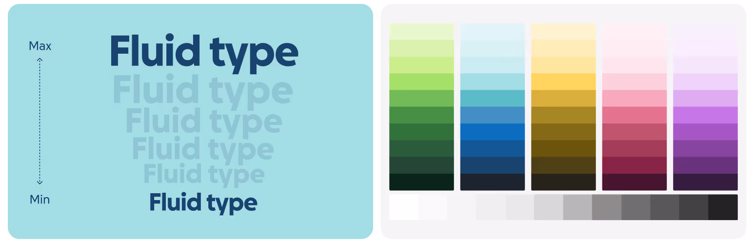
On the cusp of GoFundMe’s rebrand with GoFundMe Pro, I directed the rollout of a flexible, multi-brand, co-brand, and white-label–ready design token system.

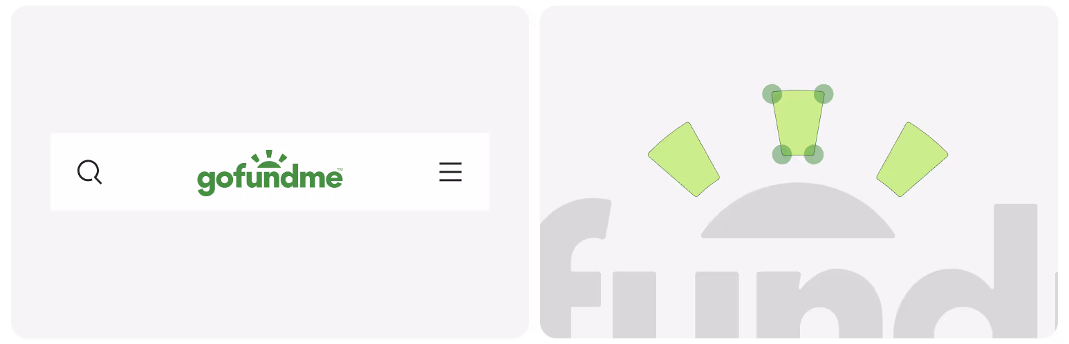
GoFundMe’s navigation was inconsistent for years, hurting usability. I led a cross-functional redesign, conducted research, and managed an international rollout that drives millions in annual product-led growth.
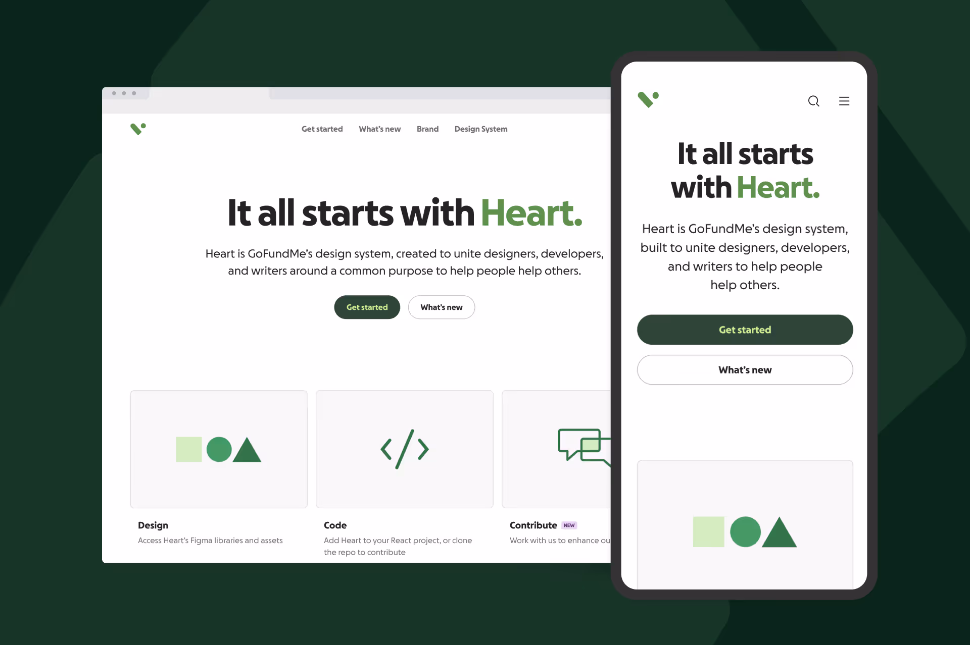
We built a design system documentation site—not a dusty style guide, but something designers and engineers actually use. It quickly became the key to scale, transforming how we onboard, govern, and grow.
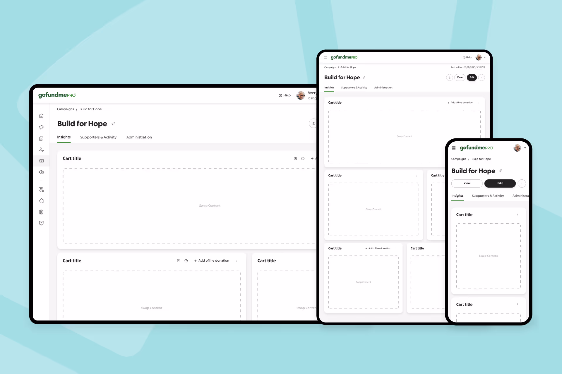
I led a comprehensive UX audit of GoFundMe Pro’s enterprise software to identify inconsistencies and develop reusable patterns, simplifying the experience and making the product more intuitive for nonprofit users.

