GoFundMe Design Tokens
On the cusp of GoFundMe’s rebrand with GoFundMe Pro, I directed the rollout of a flexible, multi-brand, co-brand, and white-label–ready design token system.
What exactly are design tokens?
“Design tokens are a method for managing design properties and values across a design system,” according to Figma's Help Center. They’re the connective tissue between design and development, a single source of truth for things like color, typography, and spacing.
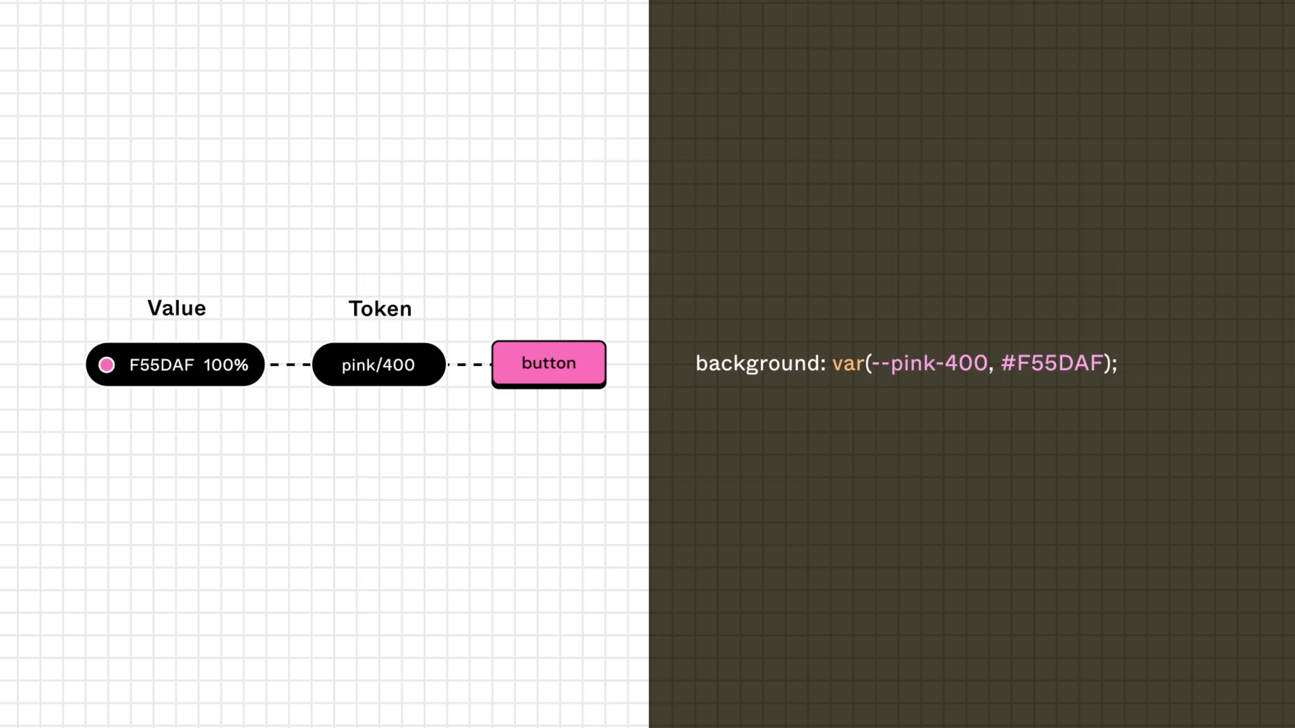
Source: Figma
The rebrand that finally made tokens happen
By the time we started our rebrand, tokens had already become an industry standard, especially after Figma released Variables. But like a lot of teams, we hadn’t carved out the time to make the investment. The rebrand finally gave us both the reason and the timing to do it.
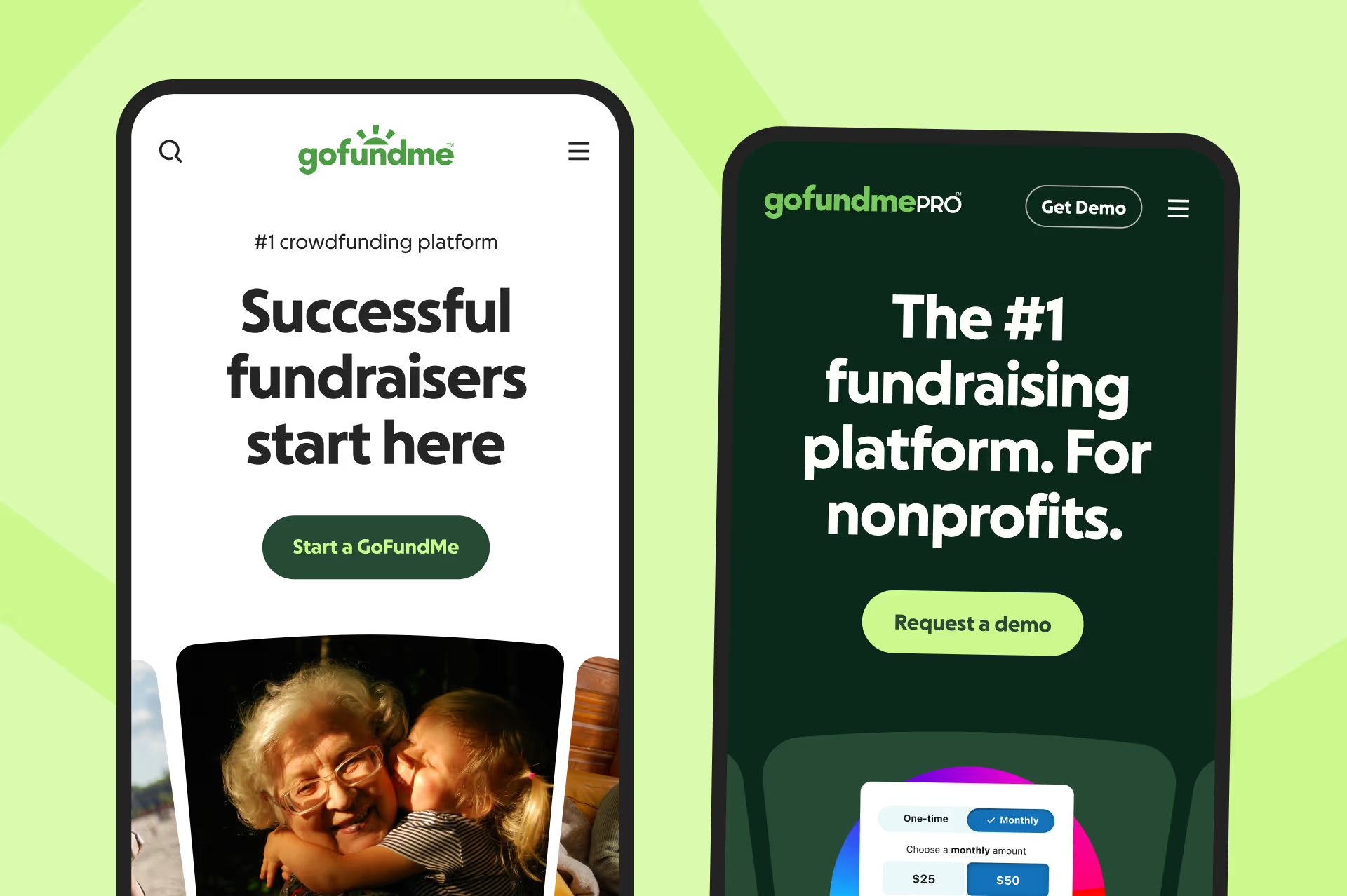
Aligning two systems from the start
We had a unique challenge: we recently merged design system teams, GoFundMe and GoFundMe Pro, but were still on separate codebases, and Pro already had its own token structure that supported white-labeling. Meanwhile, the consumer side was beginning to explore co-branded pages.
So the first step wasn’t writing tokens. It was about understanding what we already had, what worked, what didn’t, and how we could design a flexible structure that could support multiple systems and brands moving forward.
One of my direct reports led the effort, while I gave direction and refined our documentation throughout the process.
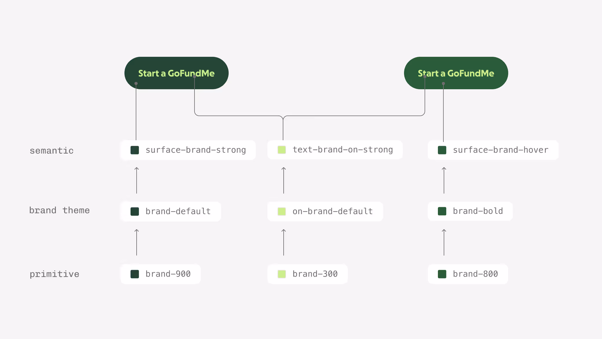
How we structured token layers
Our color tokens ended up with three clear levels of abstraction:
Primitives – raw, brand-agnostic color values (e.g., green-100)
Brand theme tokens – brand-specific mappings (e.g., brand-default)
Semantic tokens – functional mappings used in components (e.g., surface-positive-subtle)
All of these are implemented as Figma variables, keeping things tidy and consistent across design and code. The addition of a brand theme layer was an intentional decision to future-proof for multi-brand, co-branded, or white-label experiences.

Color token naming
Token names follow a structured formula based on their layer. Primitives use color-step (e.g. green-100), brand themes use brand-modifier (e.g. brand-default), and semantic tokens follow a longer part-of-thing-modifier pattern (e.g. surface-positive-subtle).
Color - The base hue used.
Step - Indicates the lightness or darkness of a color. The higher the step, the darker the shade (ex. green-100 is lighter than green-500).
Part-of-thing - Defines which part of the element the token applies to—text, icons, surface, or border.
Modifiers - These describe tone, prominence, and state, always in this order.
Naming was a surprisingly meaty topic. Designers debated “surface” vs. “background.” Engineers had opinions too. Eventually we learned the hard way that in system design, the bigger risk is indecision. Make the call, document it, move on.
Teaching design tokens to the team
We didn’t stop at the tokens themselves. We built documentation on our design system site, heart.gofundme.com, that shows how token layers connect and how to use them.
We also wrote a designer-facing “Using color” guide that explains our logic in plain language. I refined those docs myself to make them even easier to scan, breaking down each level visually.
It seems simple, but this kind of education work is what actually makes systems stick.
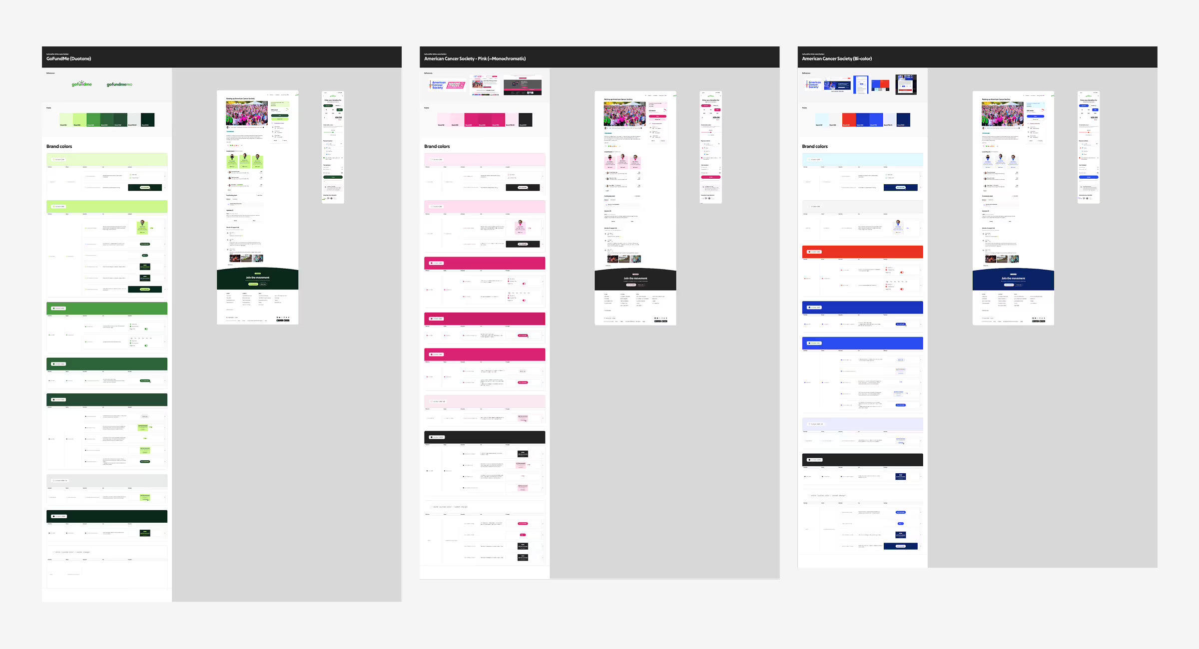
Understanding co-branding and white-labeling
We designed the brand theme layer to be flexible, but GoFundMe’s default setup relies on duotone color combinations (not exactly a common pattern). To make it work for co-branded and white-label experiences, we had to create a way to remap those values easily for different brands.
Co-branding - Both brands are visible and intentionally blended to show partnership.
White-labeling - Only the partner’s brand is shown
To help designers understand how that mapping could work, I built a demo tool in Figma where they could visually map styles across brands using Styles. Once the mapping felt right, we could translate that directly into usable tokens for each brand.
This approach helped demystify co-branding and white-labeling, and it gave designers a safe playground to experiment.
The impact
We don’t have metrics tied directly to tokens (yet), but we launched them the quarter before the rebrand, just early enough for teams to adopt them before everything changed. When the new brand rolled out, our teams got the reskin for free, giving them more time to spend on designing structural changes that reflect the new brand.
What I’m seeing now is designers thinking more systematically. They’re not picking colors based on “what feels right” anymore, they’re using tokens to make consistent, accessible choices without needing much oversight. Engineers, already familiar with tokens, now share the same mental model as designers.
And that’s the real win here: a shared language. When a design system helps designers and engineers talk about details the same way, it drives efficiency—like many of our other design system efforts that contributed to a $40M+ business impact across GoFundMe.