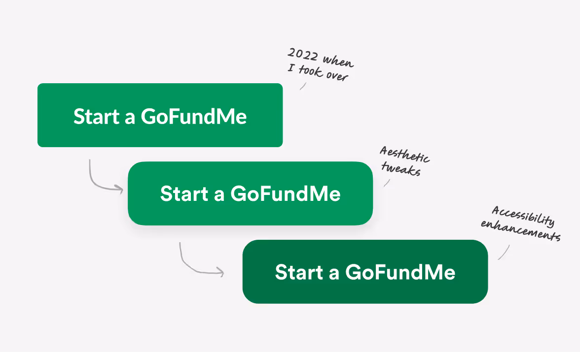
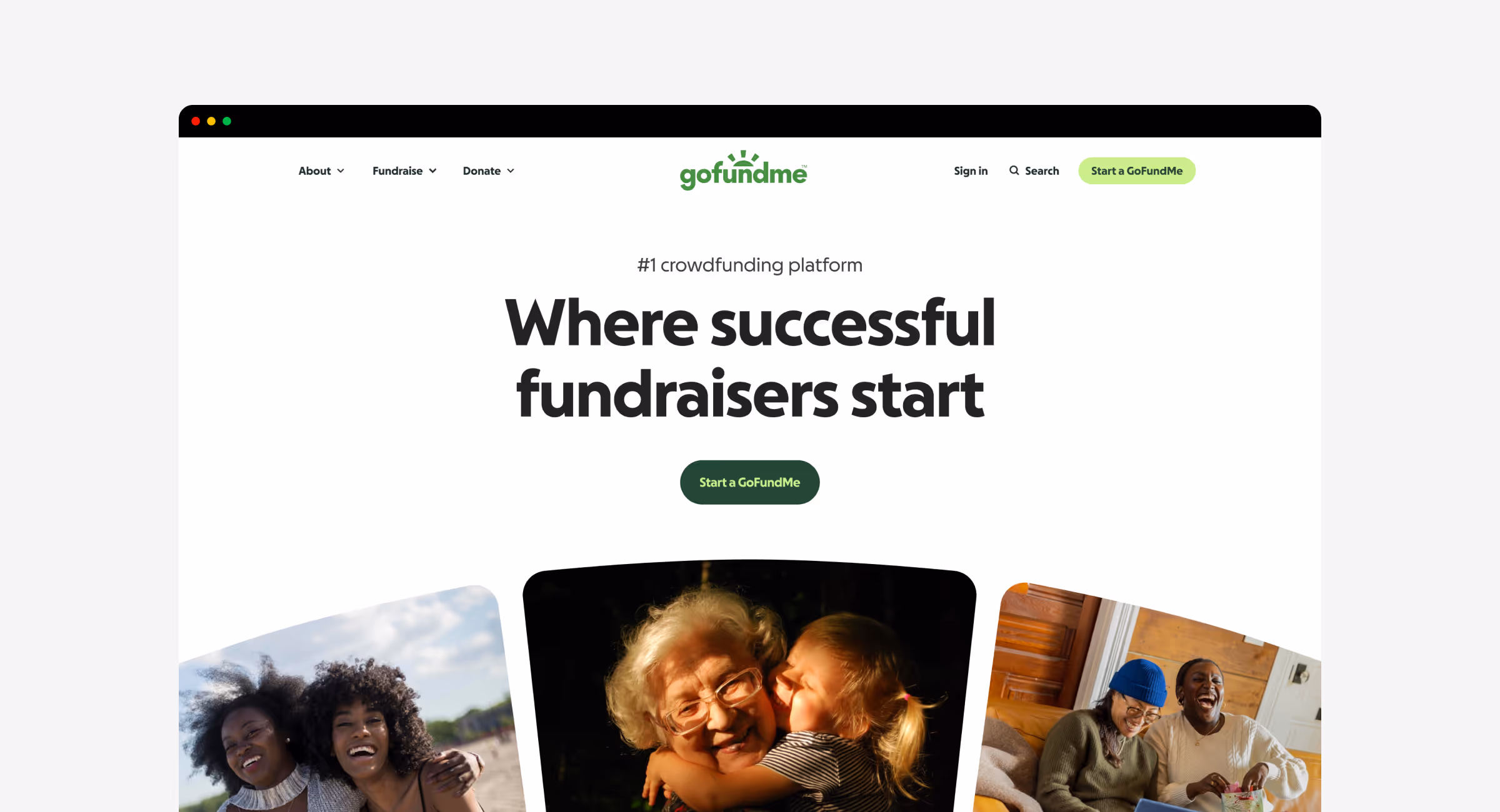
GoFundMe Rebrand
Partnering with our brand team and Koto, my role was to help shape a new identity that fit into our design system without compromising on accessibility. I led the color exploration, refined our custom typeface, and guided the team in creating a cohesive language.
Evolving the GoFundMe brand
GoFundMe helps people. Not metaphorically or aspirationally, but one person, one family, one fundraiser at a time. It’s emotional and imperfect, but real. Rebranding meant honoring those stories while imagining something better. To do that we partnered with Koto.
The challenge
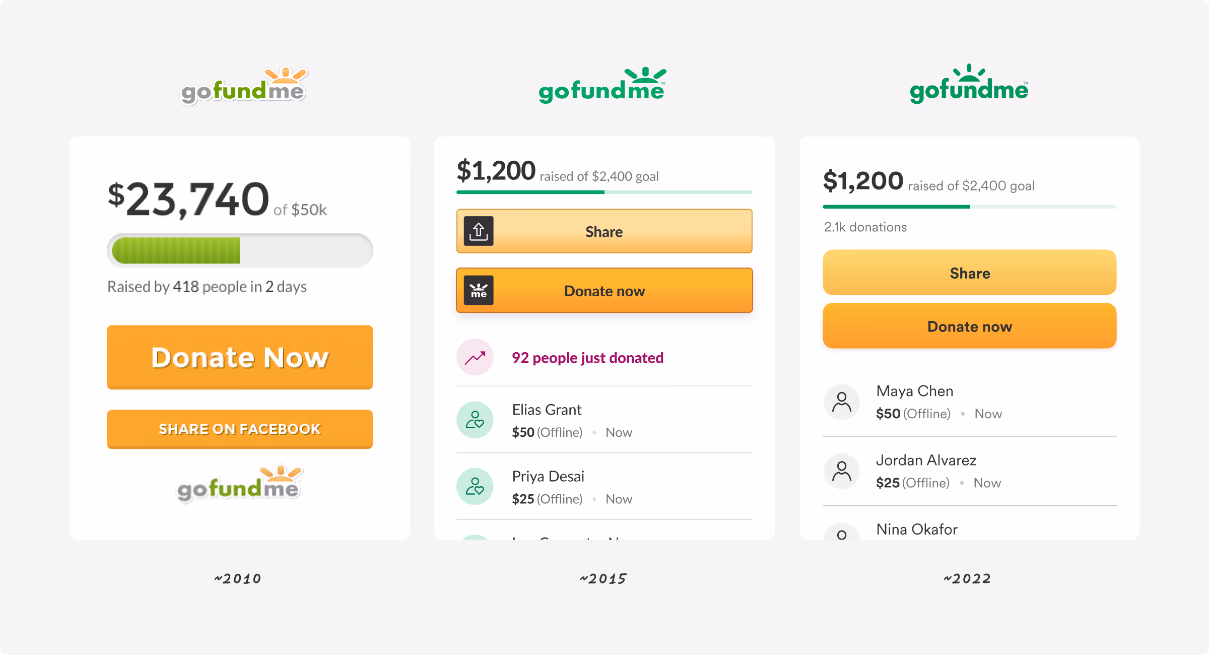
An incomplete system without range and a multi-brand problem
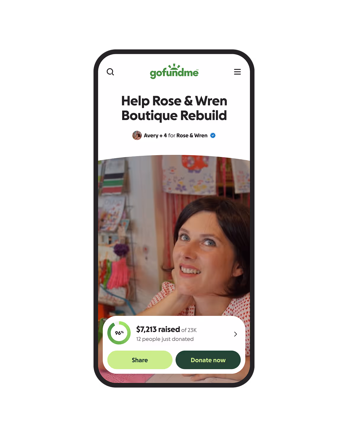
Before the rebrand, designers had done a lot to modernize the experience. It worked. It was clean and functional. But it lacked range. Our color palette was narrow and dated. We had no graphic system to create moments of emotion or emphasis. It may seem small, but on GoFundMe—where life-changing moments happen every day—visual expression matters. Some basics even clashed. Buttons fought for attention. Patterns overlapped. Our typeface, Circular, had improved our typography, but it was too wide for mobile. Progress, yes, but we all felt the same itch to do more.
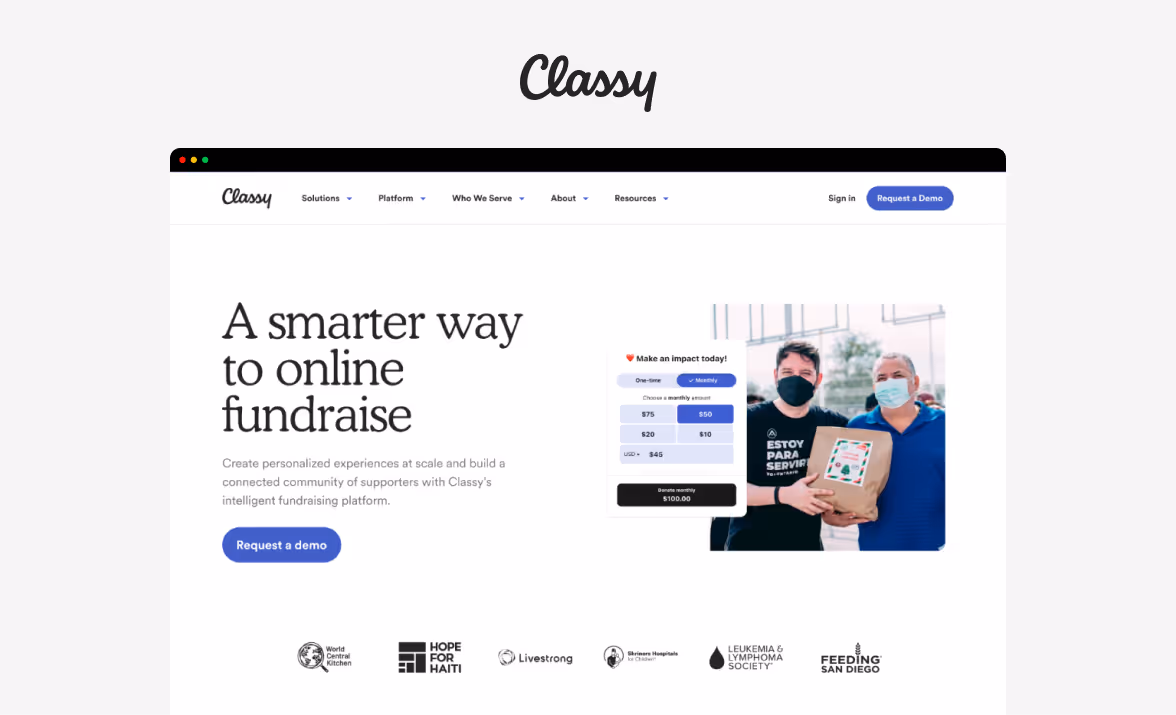
Then GoFundMe acquired Classy, a leading platform for large nonprofits. The teams had merged, but the brands hadn’t. We saw the opportunity to unite them. Classy would become GoFundMe Pro. The question was how to make the two feel like one. That question sparked the rebrand.

The Challenge
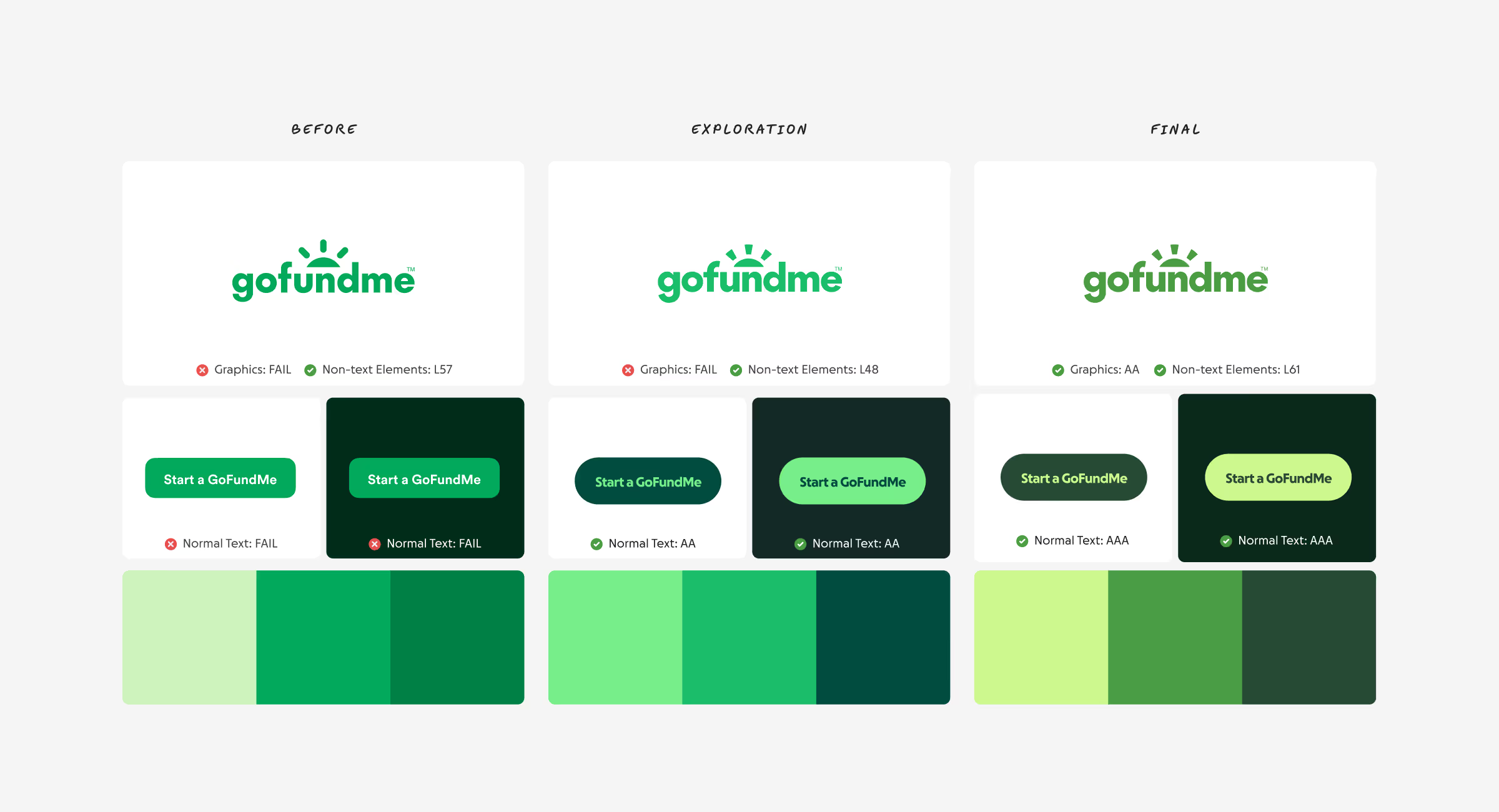
The issue with green
Oh, green. A lovely color and GoFundMe’s signature for years. But as web accessibility standards have risen, green has become tricky. To make green buttons with white text accessible, the shade must be dark—often so dark that many brands, like Credit Karma, Instacart, and GoFundMe, have traded their signature greens for similar muddier greens.

Source: Zach Roszczewski (top-left), Fast Company (top-right), Tech Crunch (bottom-left), Instacart App (bottom-right)
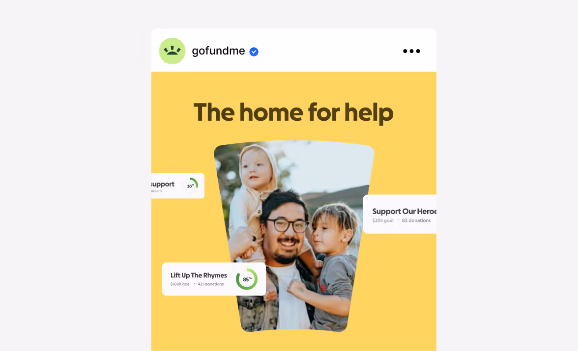
Color Direction
Making green vibrant and accessible
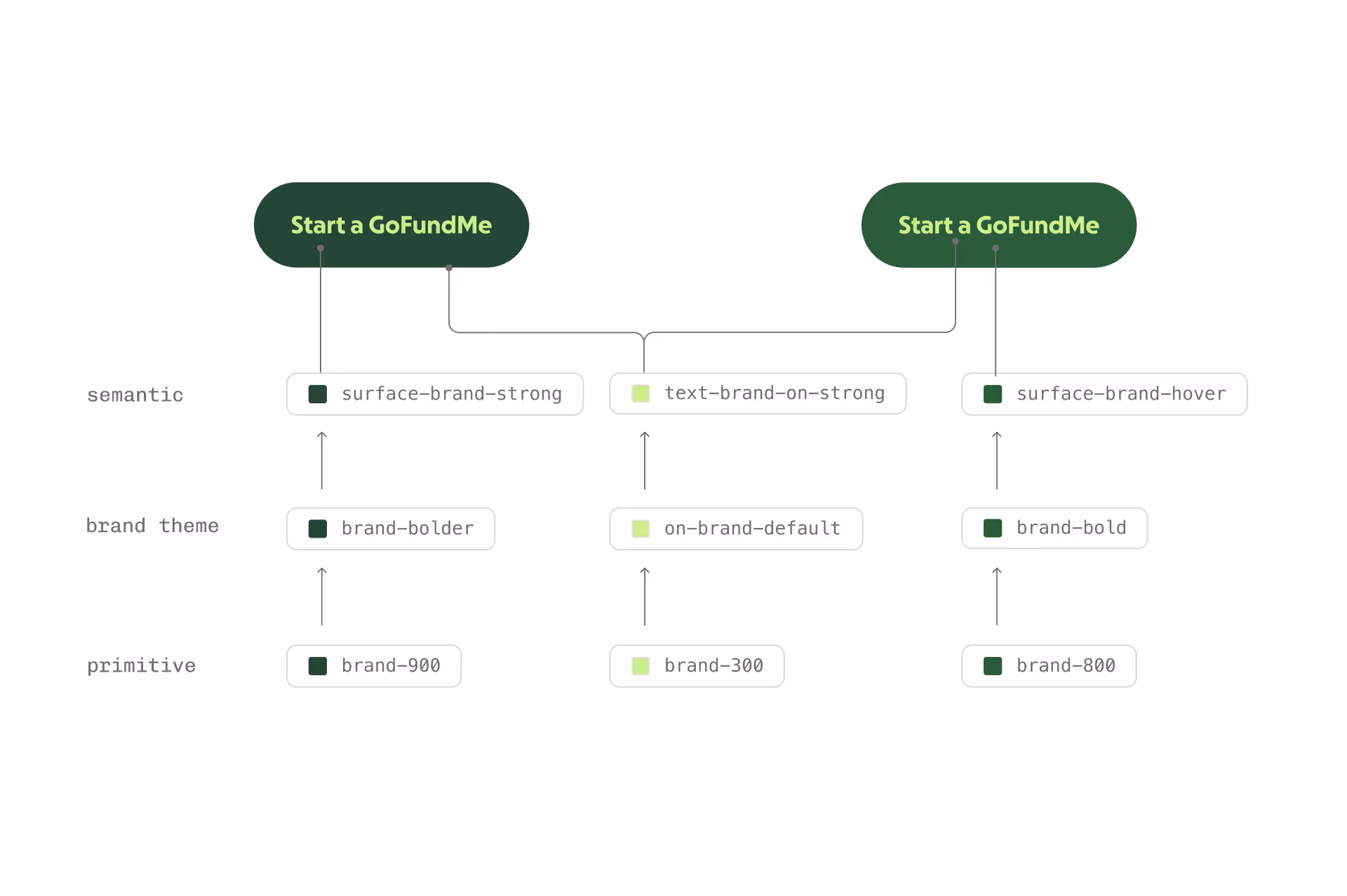
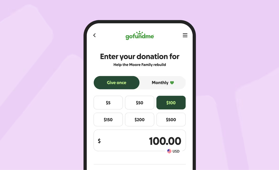
The challenge was clear: stay true to our green without dulling it. Using Leonardo, I experimented with accessible color ramps and uncovered something important. In most green ramps, the middle shades often define the brand—but they rarely meet accessibility requirements. By pairing lighter greens with darker ones, we maintained the recognizable sense of green while introducing the contrast and vibrancy we’d been missing. This led us to explore duotone colors, which became the foundation for our palette and emphasis system.
Color Direction
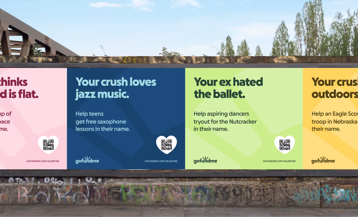
A shift toward warmth and optimism
Color trends are cyclical, and we’re changing cycles. When Apple abandoned skeuomorphism with iOS 7, flat design took off. But in recent years, the appeal of minimalism has begun to fade. Culturally, we are craving more contrast. Absurdism is back in advertising, brands are bolder, and homes are filled with color and character again.
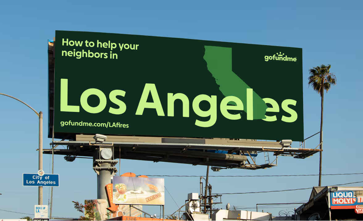
Recognizing the changing color cycle, when the GoFundMe rebrand began, one of my goals was to move us away from pastels. We needed something more vibrant, something dignifying but also encouraging. As we explored color, we leaned on our design team for feedback. Even our CEO chimed in, noting that one green felt “too electric” (he was right). We landed on an empathetic and optimistic palette.

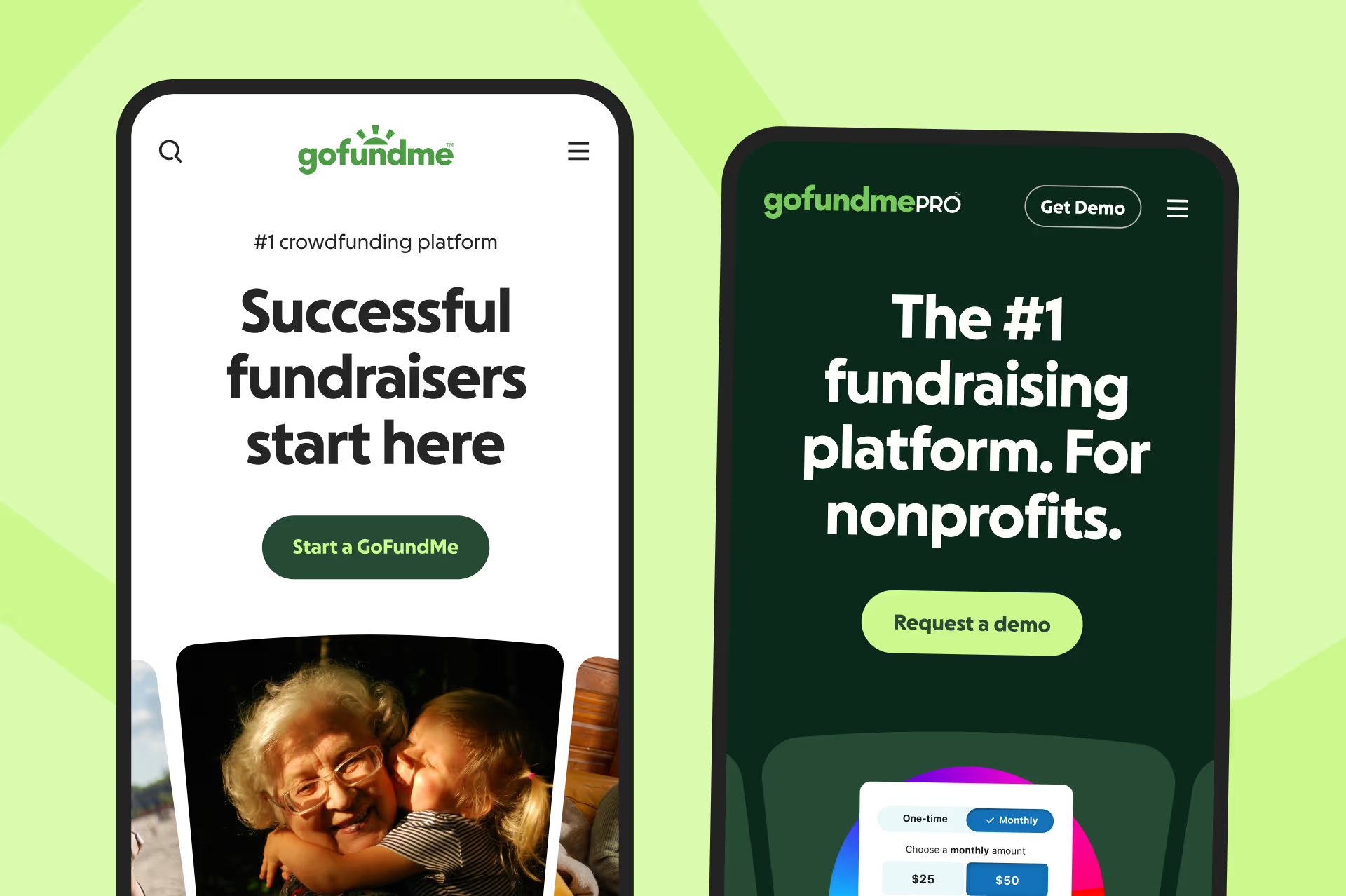
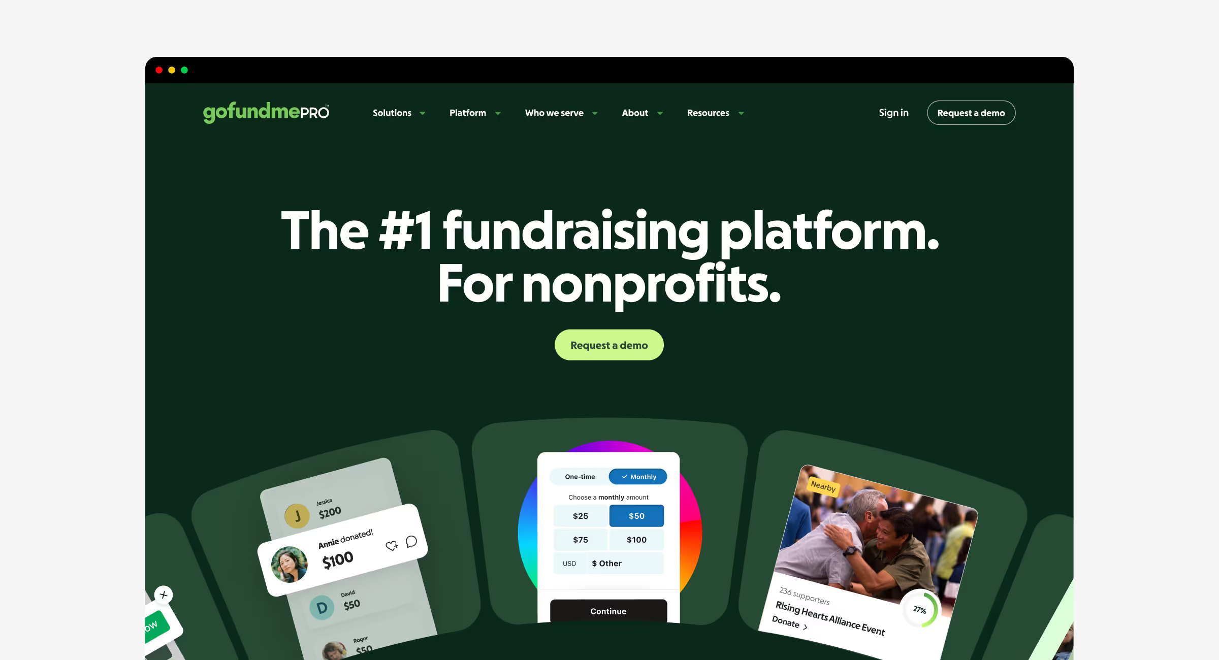
GoFundMe Pro
Expanding the brand to large nonprofits
Pro’s users are different, teams at large nonprofits focused on impact at scale rather than individual stories.
For the Pro marketing experience, we chose a dark palette inspired by the idea of “Pro” itself, similar to Apple’s Pro product line, but not black. Black felt too cold. Instead, we used the deepest green in our palette to anchor the design, giving Pro a premium look without losing its connection to GoFundMe.
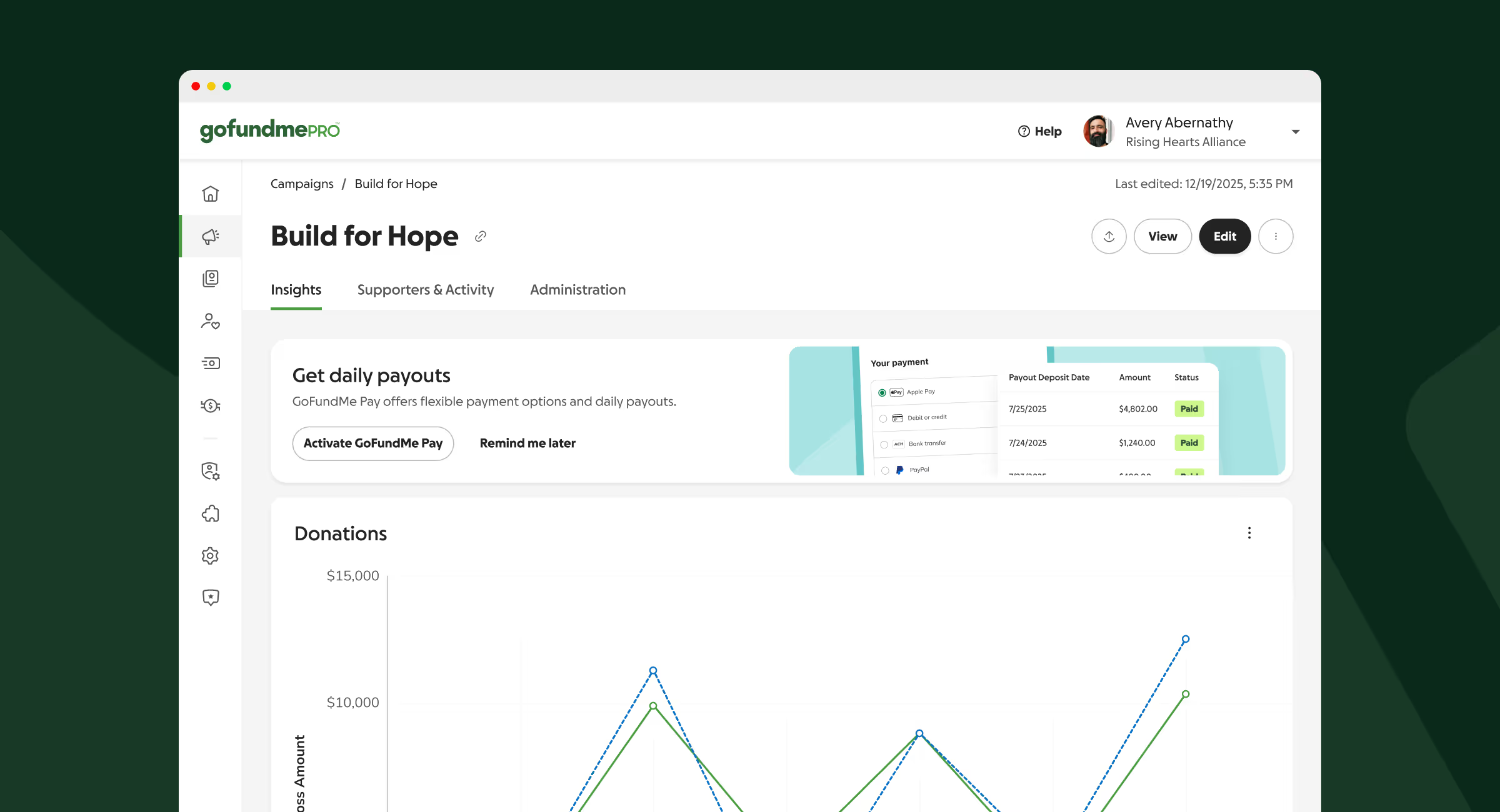
GoFundMe Pro
Inside of Pro: Less color, more clarity
Inside the product, we stripped away distractions. Less vibrant colors. Just clarity and focus, expressed through premium black buttons and an enterprise layout. Both systems, GoFundMe and GoFundMe Pro, now share the same core palette and graphic language, each adapted to the world it serves.
Type Direction
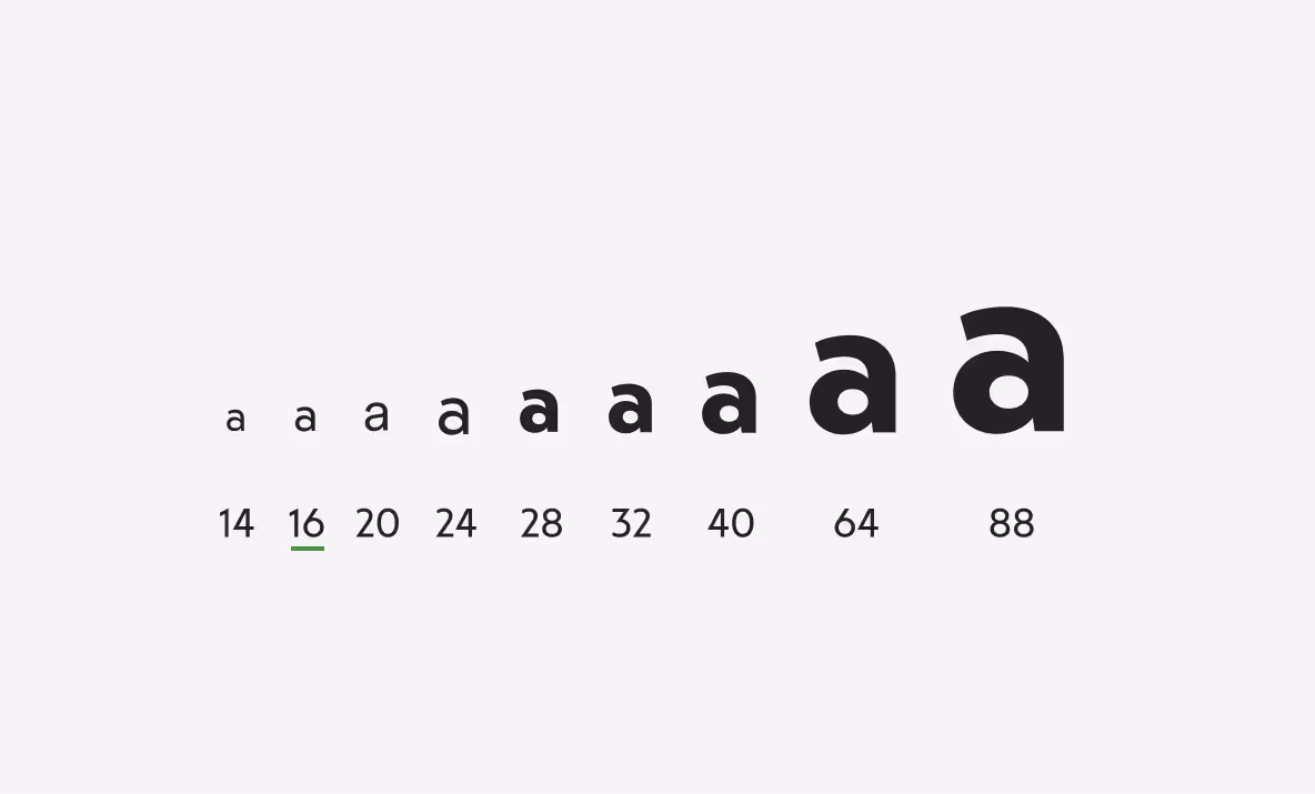
GoFundMe Sans: How a typeface earned its place in our rebrand
Koto, had strong ideas about type, but when they pitched a typeface called Melun, I’ll admit, I didn't love it at first.
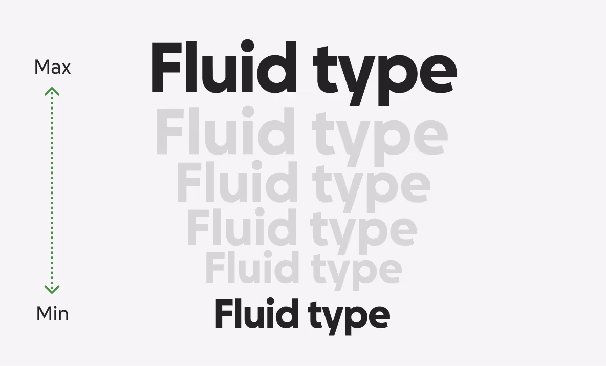
Melun had charm, but I knew it needed more refinement for our brand. Its scale was off by a few pixels from our previous typeface, Circular. That might sound small, but those pixels held together our typographic system built on musical proportions and fluid type. Some characters felt too stylized and hard to read. Still, Koto saw potential.
With my long list of requirements, we partnered with the foundry to reshape it into something new: GoFundMe Sans, refined, balanced, and unmistakably ours.
Final thoughts on the GoFundMe rebrand
There are more stories to tell about our rebrand—like the entire graphic system—but color and type were among my biggest contributions. Being part of the core team that reimagined GoFundMe was deeply rewarding; I stretched every part of my craft while keeping the people we serve at the center of every choice.
Our design system is attributed to over $40M a year in business impact, and while we don’t have metrics on the specific impact of the rebrand (yet), we know that our token system and components made it possible—undoubtebly saving the company even more time than normal.